

Landing Pages are customized web pages designed for a specific purpose, and their possibilities are endless. Our job as marketers does not end with just bringing a lead to a landing page, but also includes getting them to fill out a form or take another important call-to-action.
In fact, most organizations now demand to know which campaigns worked, with multi-touch attribution tools used to show what percentage of opportunities created for the sales teams were actually brought in by a marketing team’s efforts.
Considering all of this, the responsibility of conveying focused messaging for different customer segments lies squarely on the shoulders of a well-structured landing page. So what constitutes a good landing page?
Here are 6 effective strategies to crush your next landing page:
Header Image
Relevance, aesthetic value and relatability are three big factors you should look for in the ideal header image. It has to resonate with the product or service that’s offered and, more importantly, it has to be authentic. Overly forced stock photos are not only passé but can do more harm than good where your brand is concerned.
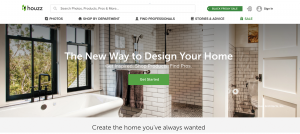
Houzz does a great job with creating the right impression at first glance. In a crowded market of well-lit setting shots, Houzz does a good job of pushing the aesthetic envelope.
Headline
Your headline is your first product pitch to your prospective customer, which means it’s important to get across your most important points, quickly. It also has to be a compelling precursor to the action you want your prospect to take.
Brainstorming with your team or agency can be a good plan of attack. The underlying purpose here is the question: “What action do we want the prospect to take that could ultimately create an opportunity to engage with them one on one?”
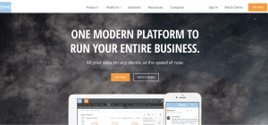
For product-based companies, this could be a demo. For services-based companies, this could be sign ups or a free assessment. Try to frame your headline with this in mind. Domo does this well with the main headline that summarizes their entire product in one sentence and a supporting one that describes product features.
Form and CTA
Keeping your form short and sweet is can oftentimes be the only thing that stands between an unknown lead and a known prospect. An infographic by Quicksprout shows how Expedia improved their form conversion rate from 42.6% to 80% just by adding the word “optional” to the phone number field.
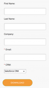
The text you choose for your CTA button also plays a pivotal role, which means it’s time to migrate away from the cliché “Submit” verbiage. Below is an example of Brightfunnel’s form which includes two mandatory fields only. The form asks for email address (required for any marketing automation tool, namely Marketo) and the CRM the lead uses that determines the quality of the lead.
Features like progressive profiling offered on Marketo also allow for marketers to collect a lot more information about a prospect over a period of time while keeping the form short. Once Marketo knows a certain bit of information, a progressive profile will ask for a new piece of information the next time that lead encounters the form.
Also Read: The Power of Recency in Reaching Your Prospects: How Consumer Intent Has Evolved
Value proposition
Be upfront about what you bring to the table on your landing page, including how it’s going to solve a current problem the prospect is facing or provide real value. Keep the focus on tangible benefits with concrete numbers like percentage of time saved or average cost reduced.
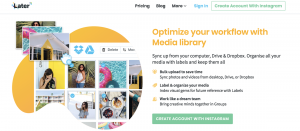
You can also include relevant icons to make the messaging more easily digested. For example, Later segments its value propositions into process steps with icons that make the benefits very clear.
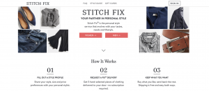
The conversion process
A large chunk of your audience could be visiting your page more than once and some of them could have been drawn in by retargeting efforts. It’s wise to offer prospects the opportunity to sign up for or pay for a service directly on your landing pages.
Keep your sign-up process 3 steps or less and keep the language you use very simple. Subscription box service Stitch Fix does well to convey clear steps of what the process entails, with emphasis on the simplicity and cost-effectiveness of the process for the customer.
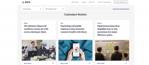
 Customer Testimonials
Including quotes from customers on landing pages is a great way to prove your brand’s value to your future customers without a separate visit to your testimonial page.
Slack does both by providing customer quotes throughout its website but also makes it easy to find customer stories that tell a more thorough picture of how they’ve helped their customers.
 Landing Pages that stay relevant, succinct, and with the above elements incorporated tend to convert faster. They also leave a better impression with prospects and help build brand value. Here’s to sky-rocketing conversion metrics on your next campaign!
Also Read: AI Evolves … and Organizations that Manage Digital Content Benefit

